Showing posts with label Tony. Show all posts

Tuesday, 13 May 2014

Concept Character Bust - Scarecrow

My final project with Tony was to create a concept for a character bust and a game menu to go along with it. The purpose of the project was to create a realistic looking bust of a character with all of the muscle groups and body of a human.

My chosen idea for the project was to create a scarecrow with a pirate hat and coat.

Synopsis:
One day there was a group of pirates raiding a farm, the character got unlucky and he ended up becoming cursed by the witch that lived there. His crew-mates abandoned him there thinking he was a goner and his body started to turn into what can only be described as being like a scarecrow. The idea of the game is to play as this pirate (now a scarecrow), being controlled by the curse set upon him to do work on the farm and to scare away intruders and pests.

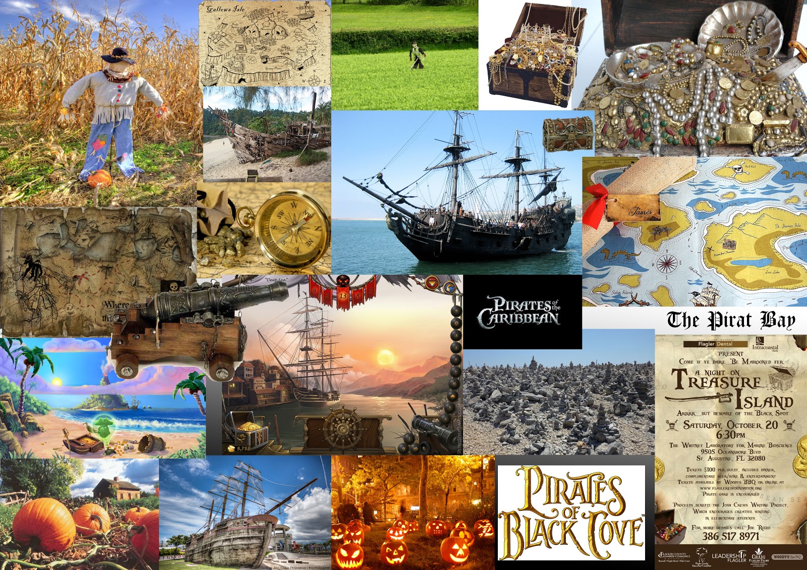
The first thing I did for this project was to create mood boards for inspiration, I searched for images that I liked or images which seemed relevant to my concept idea.
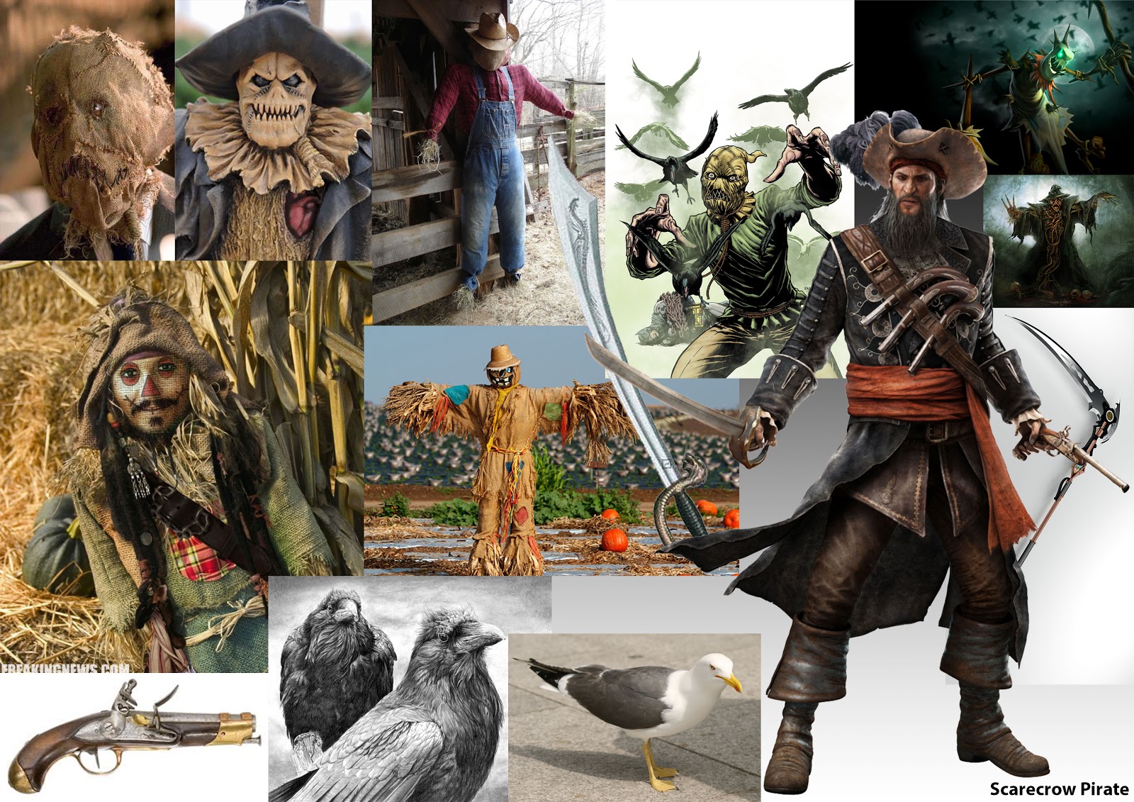


I liked the big pirate hat and the coat so I decided to base it on the image of the pirate. The scarecrow face on the left was the look I decided to create the characters face like. I had the idea of making a bird to perch on the scarecrow's arm.


 The scarecrow sculpture progress:
18th March
Today I started making the character bust, I used a long piece of wire and twisted it to create the bone structure for the bust. For the arm I used a second piece of twisted wire wrapped around the main one, this worked well keeping the structure intact whilst sculpturing it. 

Today's lesson, I added layers onto the sculptures face, chest and back to build up the form a little bit.
25th March
I also created the sack texture over the character's face by rolling out a flat sheet of clay and then by wrapping it around the face and then drawing on it to create a rough surface.
25th March
1st April

Today I created the hat, using a sheet of wire mesh cut into a circle, also a roll of wire mesh for the inside of the hat. Before creating the top of the hat from the hole, I measured it to fit his head. Using a role of wire mesh I was about to create the top of the hat structure which I was then able to use a roll of thin clay to cover. The whole hat was coated in thin layers of clay.
1st April
Once the hat had been made, I placed it over the scarecrow's head, bent it a bit to give it the right shape. 

1st April
I was able to create a feather to place inside of the hat by getting a roll of clay and sticking it to a very small piece of wire. 

29th April
The clothing was made using thin layers of clay that had been rolled out using a rolling pin and small amounts of oil. I was able to create a realistic looking coat by allowing the layer of clay to become creased while wrapping it over the model. Once the object was baked the model of the bird didn't come out very well. 

The game menu I created for this project was made up of a photo of some land, bird feathers and skulls. My inspiration came from looking at other game menus.

I took photos of some farm land which I planned to use as the background in my menu.

The twigs seem to work well with the idea of a scarecrow
I arranged feathers with the skull to create a symbol
I decided to go along with a Sans serif font for the game name, it creates a clean and readable look to the title. The bird and skull works well as it gives the idea of it being cursed, and the crow feathers are relevant to the whole scarecrow theme. 

Game menu

Tuesday, 4 February 2014

Menus and Composition

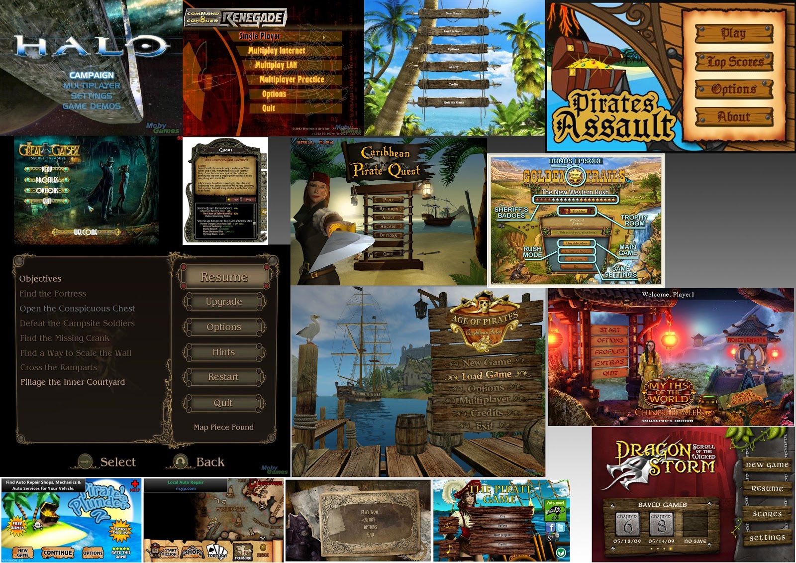
Week 18, today I gathered screenshots from in game menus to use as ideas. Tony gave a short presentation on composition.

Tuesday, 28 January 2014

Mood Boards with Tony

In today's lesson with Tony, we were in the mac computer room and he gave a presentation about mood boards.

One of the roles of a mood board is to establish a palette and to gather ideas for a design.

An archetype is the first of it's kind, a stereotype is when there are more than one of it's kind.

Our task for today is to create a mood board of a character, with the goal of creating the bust of the character.
  • Research/Assemble technical references - e.g. costume, weapons. 
  • Research/Assemble archetype characters/faces - (consider as casting list). 
  • Research Setting - urban/landscape/architectural details/culture & period. 
  • Include element of appropriate typography/fonts. (Maybe natural form/environmental). 
  • Establish colour palette (and colour swatch). 
  • Synapsis & name of game. 

Tuesday, 21 January 2014

pirate week 16

Today we were drawing a model dressed up as a pirate in Tony's class. The aim of the lesson was to create a realistic looking life drawing.


To begin with I did the drawing in charcoal to make sure everything looked okay, then it was time to colour it in using pastels. 


I think the end drawing was a success because it has a realistic look to it for the most part, the lower end of the image where the hand and gun is needed more work doing to it though. The shading and colours used on the face, hat and clothing seem to work really well.

Tuesday, 14 January 2014

Portrait week 15

Life drawing portraiture face, the aim of today's lesson was to draw out the model's face. We are working towards preparing ourselves for creating concept artwork, this drawing will be of the model's face and shoulders; muscles and bone structures.
First attempt practise drawing
To begin the drawing I drew out the form using simple shapes, a circle for the skull.

End of the day photo
The technique of drawing out the forms before doing any detail works really well as it allows me to get the drawing accurate and lifelike. I am pleased with the result in this drawing as it is my most favourite drawing this year to date.

The head is created from the skull; cranium, face, neck and jaw. These parts are drawn in using spheres and shapes. Drawing in the foundations first makes the work much easier in the long run. We were given diagrams of the forms for human anatomy, it showed simple shapes to use which really helped with drawing this piece. The muscle diagrams helped too.

Tuesday, 10 December 2013

Multi-view Observation & Clay Modelling - week 12

Today we had to make quick observational sketches of the model at different view points, we rotated around the room until we had drawn each view point. 


After that we were given 2 blocks of clay with which to sculpt a 3D model out of; the rest of the day was used to model the bust figure. The task was to sculpt it while using the live model for reference. 


I found the modelling to be difficult as I had not done any before, moving around the room while trying to get the right shape in the clay was not the easiest thing for me. It worked okay for getting the basic shape of things but it was not easy to get the muscles in. 

Tuesday, 19 November 2013

Volumetric Drawing - week 9

Today we did volumetric life drawing, the aim was to draw the female model. Capturing fast poses, tones and colour.
I didn't finish the face but you get the idea
I think that the drawing went well, the technique allowed me to capture the forms of the female body.

Tuesday, 12 November 2013

Rapid Drawing - week 8

Sketching human form in line and circle, rapid drawing

Today's class with Tony was an essential sketching, human form (lines and circles). The class were seated in a circle around the model and we were given a 10 minute time limit to draw in each seat before we had to change to the next seat around the room. We had to overlay each image on the paper with the idea of creating a dynamic scene with figures interacting. 


I think that this drawing went well, to begin we were instructed to draw shapes for each body part and that was so that we could get the correct proportions and positions for each limb; allowing us to get the correct posture and scale for things. The image was then coloured in using pastels, I went for a brown on the people to the right so that they would look like tribes people and then to the left I used fiery colours; from yellow to a bit of red, giving it the impression of there being a fire next to the people. Overall I feel that the technique used to draw is effective because it allows me to get things to the correct scale and positioning. 

Tuesday, 8 October 2013

Colour Theory - week 4

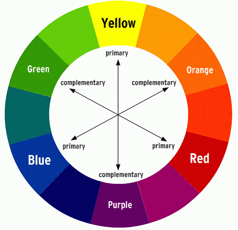
Today we learnt about colour theory with Tony's lesson, we did colour wheels, neutralisation, juxtaposition, secondary colours, complementary colours, harmony, discord, neutrals, colour perspective and mixing. The aim was to learn about how colours work together in various ways.


The colour wheel allows us to see which primary colours go into making up secondary and tertiary colours; red and yellow makes orange (a secondary colour), orange and yellow makes up a lighter orange (tertiary colour), it also allows us to see which colours go well with one another such as blue with orange (complimentary colours).

The tertiary colours are red-orange, yellow-orange, yellow-green, blue-green, blue-violet, and red-violet.

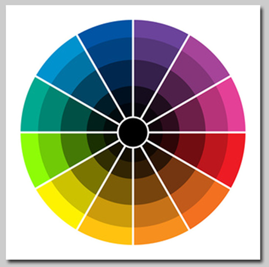
Hues are created by adding either black or white to the colour.

The chromatic scale is when there are varying levels of white or black added to the colour.

Jextaposition is when multiple colours are placed close together and this creates different effects depending on which colours are used.

Blue on red will have a different effect to red on blue, the different colours create different after images and this is what affects the perception of the colours.


When 7 of the class went to the Eurogamer Expo on a college trip, the 3 of us that didn't go were left behind to do an extra lesson with Tony; Tony set up a scene for us to draw using an abstract impressionistic style.

The windows were closed to try and darken the room as best as possible and we used black paper with coloured chalks to draw the scene. The lights set up were warm red lights which helped create the glowing and opaque effects on the balloons.
This was my drawing at the end of the day, the parts I am most please with is the lighting and the shades of colour which give it the impression of being 3 dimensional.

Subtractive Primary Colours 

When it comes to printing, a printer uses Cyan, Magenta, Yellow and Black.

Cyan and Magenta makes Blue;
Magenta and Yellow creates Red;
Yellow and Cyan makes Green;
Cyan and Magenta plus Yellow creates Black.

Subtractive means that the colours absorb and reflect light rather than create it, this is the difference between viewing something on a computer screen (digital etc) and viewing something such as paper. Red objects will absorb green and blue light, reflecting only the red back at you.

Additive Primaries

These colours create light, these usually come from a computer or television screen (creates light). The colours on the screen are created from Reds, Greens and Blues.

Red and Green makes Yellow;
Red and Blue creates Magenta;
Blue and Green creates Cyan;
All three colours together create white light.

The difference between Additive and Subtractive is in the name, the additive colours are light sources and subtractive colours are created by the way they absorb or reflect light.

Interestingly, the Subtractive Primary colours happen to be the secondary colours in the Additive Primary colour wheel.

Tuesday, 1 October 2013

Geometrical Analysis of underlying form - week 3

Week 3; today we did Geometrical analysis of underlying forms. The task was to draw either a natural or man made form, I chose to draw the natural object which was an old sheep's skull. The idea behind the lesson was that it would help us to improve our understanding of 3D model wire-frames. Chiaroscuro was the word of the day, it means a high contrast between light and dark.


Both drawings

For this drawing I first started off by drawing shapes and drawing the underlying forms. The technique allowed me to see how the skull is formed and allowed me to draw what was there rather than what I see. The drawing was done in chalk, charcoal, compressed charcoal and pastels on blue paper. The shadows were done using the charcoal and rubbed into the paper. I think that the drawing technique works well because drawing in the form allows me to draw the correct proportions for the object and to make it lifelike; it also allows me to understand the object form better which should help when it comes to modelling in 3ds Max.

Georgina O'keefe's skull drawings are great examples of the technique.
The contrasts in the images bring out the form really well. 

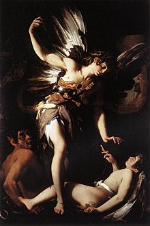
Chiaroscuro can be seen in Giovanni Baglione's Sacred and Profane Love painting with it's rich use of light and dark contrasts. 

Tuesday, 17 September 2013

First lesson with Tony - week 1

In Tony's first lesson, we were given the task of drawing the room with stacked boxes. The aim of the lesson was to draw the room by using spanning, proportions and negative forms. We also learnt about vanishing points; 1,2,3 point perspectives and angles. 


The drawing method and technique I used today worked okay, the trouble I had with it was if I made a mistake on part of the drawing then it meant the things I measured on the paper next to it could end up in the wrong place. The drawing would only be accurate if I measured everything correctly and if I started drawing how I think it should look it started to go wrong. 

The use of vanishing points can be seen in Leonardo Da Vinci's Last Supper painting; the ceiling, floor, and horizon line all points at where Jesus' sits, specifically towards his face. The last supper uses a 1 point perspective.

Examples of 2 point perspective:
In 2 point perspective, there are two points where these square objects line up to. 3 point perspective adds another point in where straight edges are drawn towards.