Showing posts with label Concept Art. Show all posts

Friday, 7 February 2014

What is Concept Art

Concept art is a form of illustrative work used to represent ideas, designs and moods for various subjects. There are many reasons why there is a need for concept art; in the games industry, concept art is used to help the other artists in creating game assets such as 3D models of characters, weapons, items, levels and enemies etc; without the use of concept art, assets created may end up not fitting well together resulting in wasted time and loss of money; the different artists will have their own ideas and their assets may not mix well without the direction of the concept art.

Concept art can be created as either traditional art or digitally in applications such as 'Photoshop' and 'Coral Painter' with the use of a graphics tablet. The artist usually starts off by making lots of thumbnail sketches in order to get as many ideas out on paper in as little time as possible, the best ideas are then taken and improved upon and these eventually become illustrations.

Here is an example of thumbnail silhouettes from Jeff's Art 2011

Silhouettes are the quickest way to draw out ideas of characters, it allows the artist to draw without having to think about the details of the design. Once the correct shape has been identified, the artist can then add in more lines and detail by using a contrasting colour.

Designs with added detail and tones from Jeff's Art 2011
Coloured Jeff's Art 2011

Concept art can be useful when pitching a game to potential investors or publishers, it can help to sell the idea of a game if the investors like the visual style of the game.

It is not just video games that make use of concept art; for instance animations, films and comic books usually make use of concept art in their creation. Concept art may also be referred to as visual development or concept design, these terms are usually applied to retail designs, set designs, fashion designs and architectural designs.

Light and Shadow

I created an image of 5 primitive shapes in order to show light and shadow.

Lighting and Shadows example

The varying tones are what create the illusion of a three dimensional object rendering on a flat surface.

Colour Theory

Colour wheel, primary colours, secondary and tertiary colours.


When we mix two primary colours together, we result with a secondary colour; any colour opposite a colour is known it's complimentary colour; e.g. blue is complementary to the colour orange. A tertiary colour is made from mixing either two secondary colours or a primary with a secondary colour.

Knowing colour theory is helpful for when working on illustrations and concept art because certain colours will always look better together than others.

The colours Hue is the position on the colour wheel; Saturation is how rich the colour is shown with greys being the lower end and neon colours being a high value.

A warmer colour such as red will always appear closer than the cooler colours such as blue.

Tone

Here is a tonal palette of colours between black and white that I have created in Photoshop.


Tone is the value of darkness and lightness used to render images on a flat surface.

Friday, 10 January 2014

The Perspective in Concept Art

Video games that are represented in 3 dimensional graphics allow us to experience realism in the virtual world; perspective allows us to mimic the real world by adding depth to the rendering. 
2 point perspective 
The image above is an example I made in Photoshop; the object would be more realistic if the vanishing points were spread further away off the image. 
2 point perspective 


3 point perspective 
In a perspective drawing, an object gets smaller the further away it is from the viewer. 

If an object overlaps over another object, it will appear closer to the viewer. 

Colours are less saturated the further they are away; the more air the light travels through the more the colour is affected. 
Distance - Saturation 

1 point perspective 

The 1 point perspective was used by Leonardo Da Vinci in his Last Supper painting. 

The Composition of Concept Art

When concept art is created; lots of planning and thought goes into the process. Concept art is created using a set of rules to allow for a pleasing appearance/layout. 

One important thing is to start with is the horizon line; the artist must decide where the horizon will be so that they can see the perspective. The horizon line fits best sitting on one of the rule of thirds. 

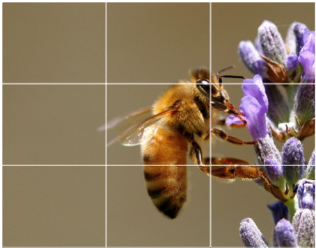
The rule of thirds is where the image is divided into a grid of 3 by 3; the main focus point of the image should intersect where the horizontal and vertical lines meet. Other parts of the image can be less to scale, contrast or colour; leading eyes back to the main focus point. 


Using the the golden ratio 1:1.618 allows for the viewer to focus on the main area of the image. 


The diagonal rule can show movement, such as a beach shore line or a river. 

An S-line is for example, a curved road in the shape of the letter S; it shows flow or movement within a scene. 

The triangle rule is where three objects are positioned in a triangle; our eyes naturally move between objects. Most humans are used to reading from left to right. 

The frame rule is where an object reveals another focus point through a hole such as looking through a keyhole or a window; the object we are looking through is like a frame. 

Avoid Clutter; any unnecessary elements in the image will distract the viewers from the main focus points of the image; distractions or clutter may appear in the foreground or background of the image. Light objects against dark objects, flares, telephone poles, wires, etc can create clutter in the composition. 

Undesirable Mergers; avoid positioning a tree directly behind a character, if a tree appears to be growing out of the character it can make the image less effective.